In 2019, Aqua Nutrition came to us for help with developing their brand and advertising their products. Aqua Nutrition sought to be an industry leader in water-soluble CBD products and needed a bold brand to separate them from the rest.
Logo
We wanted to create something clean and simple that held important elements of their company. Aqua Nutrition had requested multiple variations to help showcase their brand in multiple ways. Because their product distinction is its water solubility, we introduced a water droplet in their shortened variation, and for their longer variation, we added a wave in the Q.
Colors
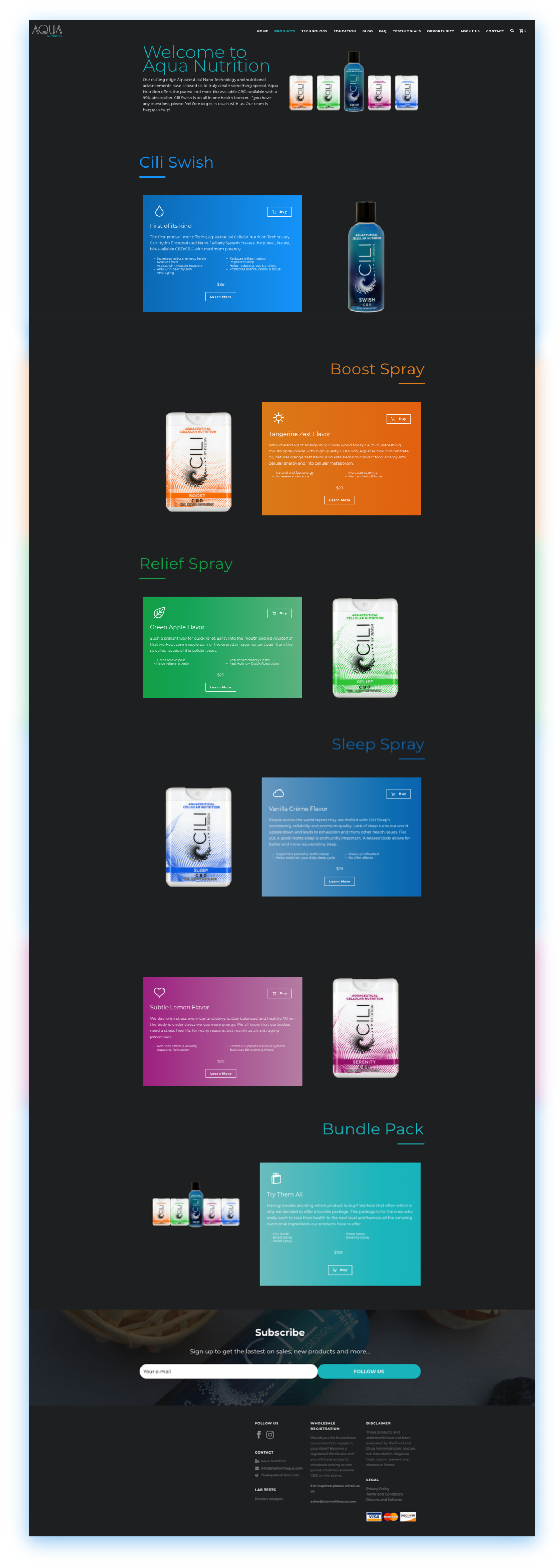
Each of Aqua Nutrition’s products has different results. From pain relief to relaxation we wanted to ensure that we matched the colors to the results of each specific product. Using vibrant colors, we also help grasp user attention and bring excitement to their revolutionary products.
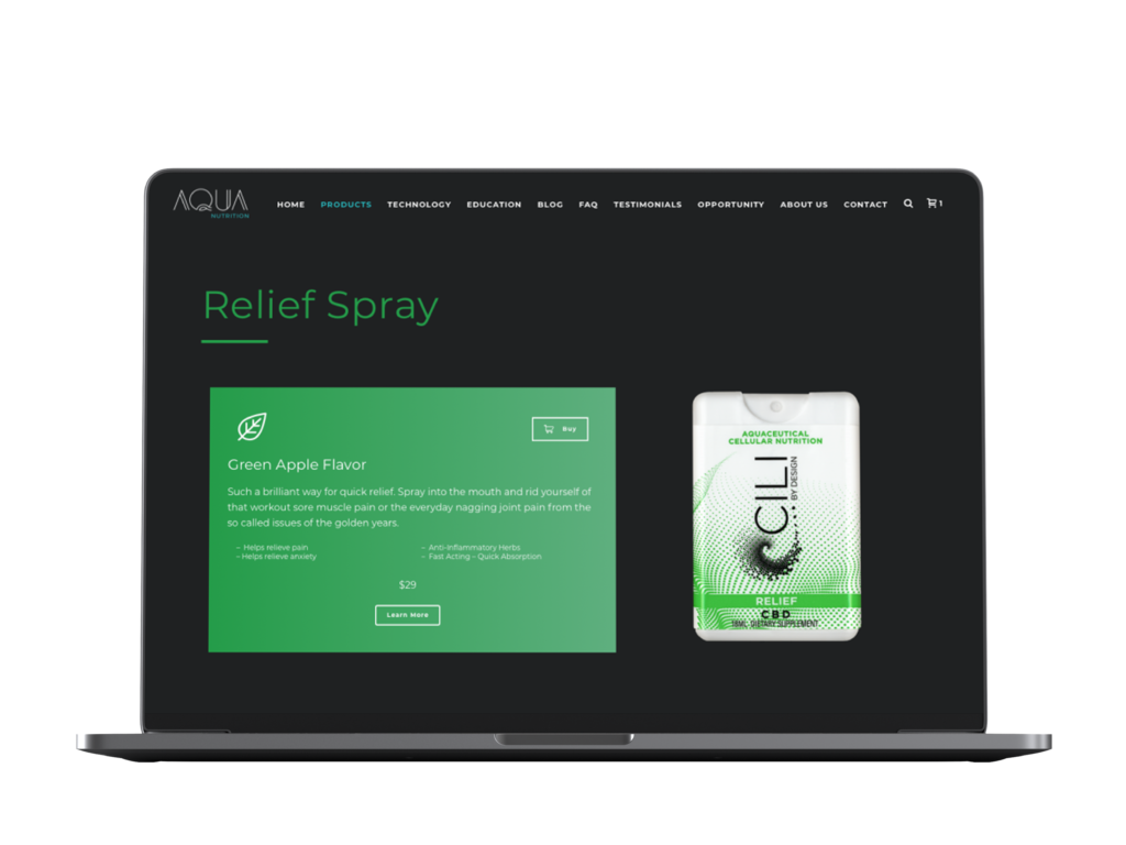
Web Design
For this site to stand out, we knew that the dark theme was the way to go. We focused on incorporating the different product colors as emphasis throughout the site. Aqua Nutrition also wanted to help educate their website visitors about their products, so we worked to ensure that the content was well presented and streamlined throughout the whole user experience.
Icons
To help build awareness about their ingredients and how they make their products, we helped Aqua Nutrition create custom icons. These icons allowed them to advertise their product details with a simple and aesthetic design.
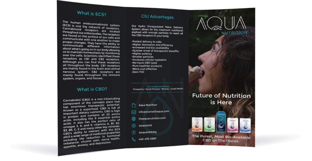
Trifold
To help educate their audience about their products, we helped Aqua Nutrition design a trifold to go over their technology and its benefits. Throughout the design of the trifold, we made sure to match their brand identity that we established in their logo and on their website.